Tomabel
Tomabel
“A tomato is like a woman,” The Shtick once said, “it’s all about the shape and the taste.”
The time to overthink whether to agree with the mission to create a clear brand promise, market position and complete branding for a premium range of Tomabel tomatoes was less than the average Bad Religion song.

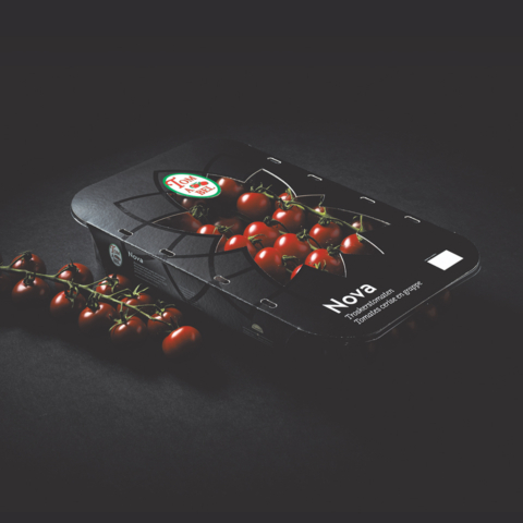
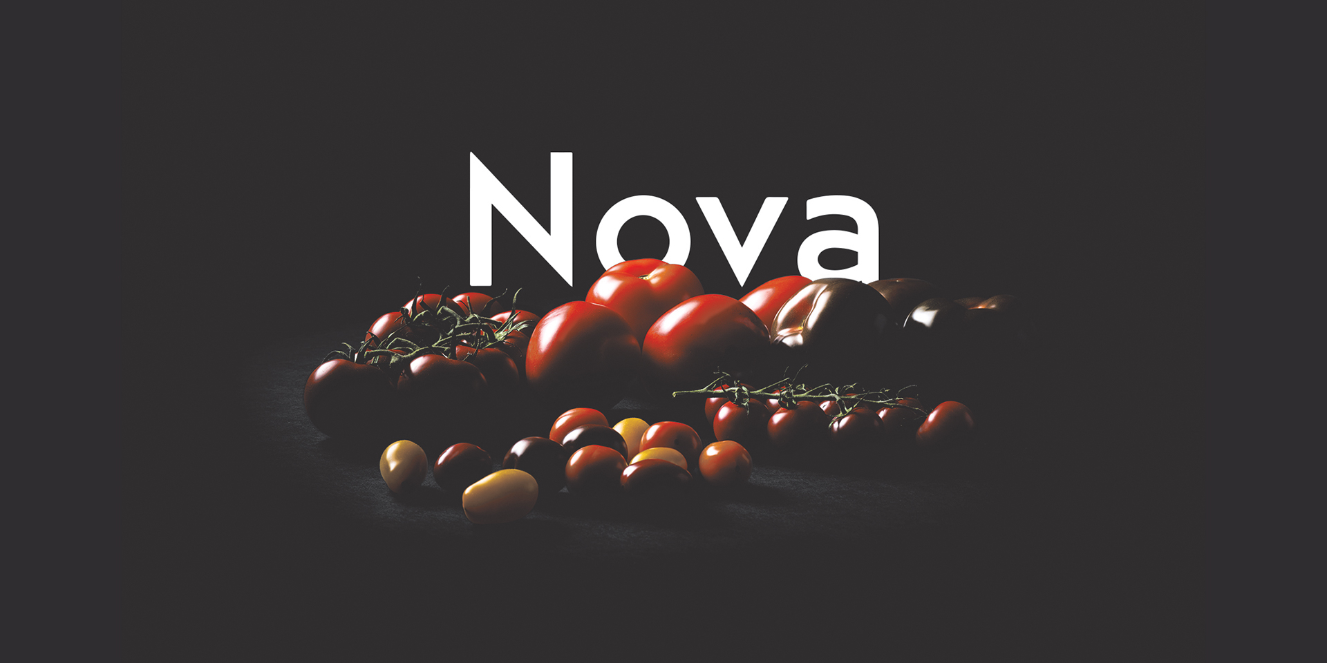
The Shtick came up with Nova and there was a good reason for that: a new star was born. This new specialty high quality local product deserved a premium appearance to meet the expectations.
Before drawing or designing anything, there was a long road ahead, filled with strategic analyses, workshops and brainstorm sessions. The result can be found in a store or supermarket near you.
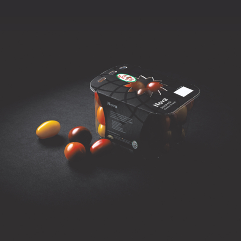
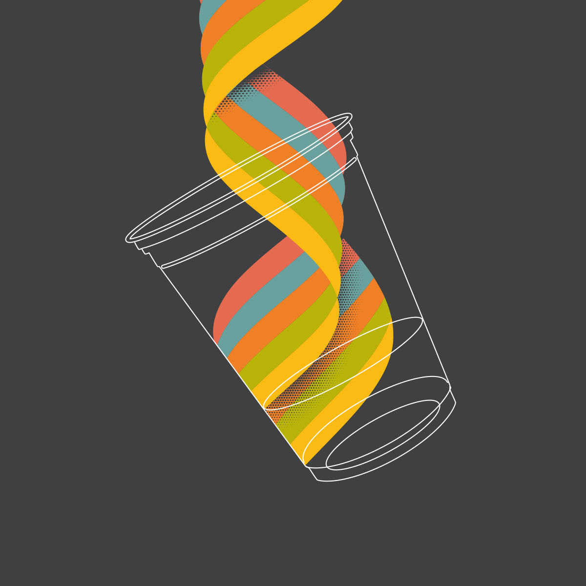
The cut-out for the package was inspired by the shape of a tomato slice and customised for the 7 different types of Tomatoes within the Nova range.
Butter my butt and call me a biscuit. Want more?
The Shtick picked two more projects from the pile. Random, like twists in David Lynch movies.